How linear-phase filters can still cause phase distortion
This piece looks at cases where linear phase response doesn’t give you quite the behaviour you might have expected, and where ‘under-filtering’ can actually be worse than either heavy filtering or no filtering at all.
People often ask me to talk about the waveform distortion that can be introduced by filtering. Each time I sit down to write a Filter Wizard piece on this topic, I either get overwhelmed by the amount of writing effort needed to encapsulate it at reasonable length, or I get sidetracked by an interesting nugget found lurking, metaphorically speaking, behind the cushions of the sofa (the couch, in North America). So, this column covers just a particular nugget, it’s not the essay on what happens to signals when you pass them through filters. For the moment, on the matter of filters and waveform distortion in general, I’ll just leave it at “well, what did you expect?” Filters inevitably change the phase and amplitude balance of frequency components in a signal. This inevitably hurts the ‘shape’ of the signal. To use filters effectively while not affecting the information in your signal, the trick – to quote Peter O’Toole in Lawrence of Arabia, “...William Potter, is not minding that it hurts.” One day I’ll find the time to talk at length about this. For now, back to the nugget.
I’m sure many of you will have had an encounter with an FIR filter, either practical or theoretical. It’s widely written that FIR filters with symmetrical impulse responses are valuable because they delay all frequency components in the input signal by the same time value, so preserve phase relationships whether or not they change the amplitude of some of those components. This is partly true, but there’s an ugly little catch that rarely gets discussed. So let’s discuss it now!
Most tools for analyzing the response of filters allow you to plot the phase response of a filter either “wrapped” so that it fits into the range of ‑pi to +pi radians (or ‑180 to +180 degrees if you want to go all Babylonian on me), or “unwrapped” so that the derivative of the curve is smooth, reflecting the generally smooth nature of the group delay of a realizable filter circuit.
Except, even when you choose an unwrapped presentation, sometimes you still get these ‘jaggies’ in the phase response plot in the ‘customizer’ graphs. At a training session once, an attendee asked me if these were caused by errors in the algorithms used to create the phase plots. I was able to explain, at least partly, why they were ‘really’ there. Boy, you do need to be quick on your feet in these sessions, though.
Look at figure 1. It shows the magnitude, unwrapped phase and group delay of a routine lowpass FIR filter. It’s a 15-tap filter with a -6 dB point at 0.15 times the sample rate, using a Hamming window. Now, the software tool used here doesn’t cheat the delay plot just because it ‘knows’ that it’s a symmetrical FIR filter; the phase and group delay really are (separately) calculated point by point. You can see that it’s constant, and this might lead you to infer that the phase shift should be proportional to frequency (group delay by definition being the negative of the derivative of the phase response).
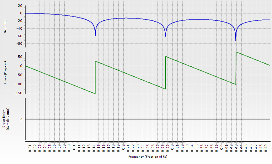
But that phase plot tells a different story; every time the frequency passes through one of the stopband nulls, the phase response jumps up by pi radians (180 degrees). The phase response is made up of a number of straight-line segments; all have a constant slope, but the phase is definitely not proportional to frequency through the stopband segments. This is a real effect, not a consequence of sloppy programming.
Figure 1: An example FIR filter, showing phase response ‘jaggies’.
Now, the ‘problem’ is that pi radians, or 180 degrees, represents an inversion of the signal passing through the filter. If you ‘take away’ the phase shift corresponding to the static time delay of (in this case) seven samples, you’ll see that as you move into the stopband, the filter’s signal polarity flips abruptly between non-inverting and inverting as you pass through each of the null frequencies.
To be honest, when we plot this kind of behaviour on an unwrapped presentation, we would really like to see the phase response jump up by pi radians in the flipped segment and then jump back to where it would have been. The trouble is, we can’t say where it would have been (to within multiples of 2pi radians) without referring to prior values on the plot. The plotting routines used here, as is common, don’t “look back” at previous portions. This phase behavior is sometimes pointed out in textbooks, but the usual line of reasoning is: why bother about this? If the delay is constant, there can’t be a problem. Right? Besides, this is the stopband; there’s not much signal here and we aren’t interested in it.
But here’s the next factor to consider: sometimes the stopband rejection might not be high. Consider the common box-car averaging filter, which is nothing other than a FIR filter all of whose coefficients are the same. It’s rather generous to refer to those regions between the nulls as ‘stopbands’ at all, since they hardly ‘stop’ those frequencies, but merely hinder them a little. Figure 2 shows a response plot for a seven-sample averager.
Figure 2: Amplitude, phase and group delay plots for a seven-sample averager.
Averaging filters are often used to ‘smooth’ data sets to suppress random noise and reveal underlying trends in the data. They are commonly used in the financial world, for instance. A seven-sample moving averager can be applied to daily data to remove both noise and weekly fluctuations in, say, a commodity price. This filter will have nulls at 0.1428 price wobbles per day and its multiples (in other words, once every 3.5 days, once every 1.75 days, and so on). But let’s suppose that this price has a consumption-driven pattern with a periodicity of six days, for some reason. Expressed as a frequency, this is 0.1666 price wobbles per day. We can see from figure 2 that this frequency lies in a ‘jumped up’ region, and yet the magnitude of the response is only about 13 dB down.
Building up a spreadsheet to analyze the output of such a process is easy. Figure 3 shows the six-day fluctuation on a daily scale (the higher-amplitude trace) and the output of the seven-day averager. It confirms the hypothesis: in the filtered data: the six-day trend is inverted. If you don’t take that into account when reading the smoothed data, you will totally misinterpret any underlying causality in the six-day cycle.
Figure 3: A six day fluctuation, and the seven day moving averager’s response.
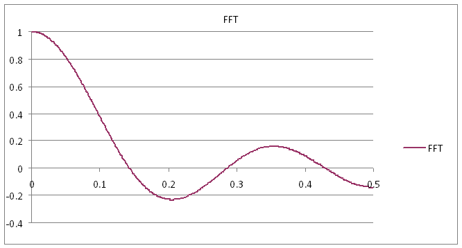
The thing that misleads us so often with these frequency response plots is that we conventionally plot only the magnitude of the response, whether expressed in linear or dB form. Now, the frequency response is nothing other than the Fourier transform of the time response, and if we plot the amplitude of the Fourier transform of one of these offending filters, we find that it goes negative in these regions, as seen in figure 4.
Figure 4: The FFT of a seven sample averager goes negative.
That makes sense, when you think about it; an amplifier with a negative gain is an inverting amplifier, and those little bits of rogue stopband are no different – they are regions within which the filter is inverting.
Such processing can cause problems with electrical signals too. The problem is at its worst for very simple filters that don’t have high attenuation in the regions where the phase is ‘wrong’. It can particularly be a problem with some simple FIR notch filters, as well as the boxcar average above. It’s particularly significant when the shape of a waveform is subjectively evaluated for clues as to what processes are occurring. Interpretation of signals acquired from physiological activity can be affected by the changes wrought by filtering. Figure 5 shows a synthesized neural potential signal (the one that peaks first), and the somewhat different responses through a normal seven sample averager, with a width of 1.43 ms (the darkest, slowest trace), and the same filter but with the phase jump synthetically removed so that all components stay in phase. The difference is subtle but significant for nerve conduction experiments.
Figure 5: Stopband phase shift from an averager does affect the signal.
The moral of this part of the story is that under-filtering, either through laziness, lack of processing power or a desire to have minimal impact on the signal, may be a misplaced belief. You should use either a filter whose stopbands are deep enough that your signal can’t be corrupted by unexpected phase jumps in stopband signals, or a filter that doesn’t have those phase jumps in the first place.
Can we make those phase jumps go away by design? We’ll see next time. Meanwhile, keep an eye out for that FIRry phase flipping!


